Page 2 of 2 FirstFirst 12
Results 36 to 41 of 41

Thread: Thoughts on new AFC Logo

  1. #36
    Join Date
    May 2007
    Location
    Boise, ID
    Posts
    892

    Default

    It's defiantely a clean professional logo, but to me it doesn't scream falconry. I don't know if that was the point or not, but for a falconry org it would make sense. Now that I see the different colors and sizes I think it will look great. The pictures before didn't quite show it to me at least.

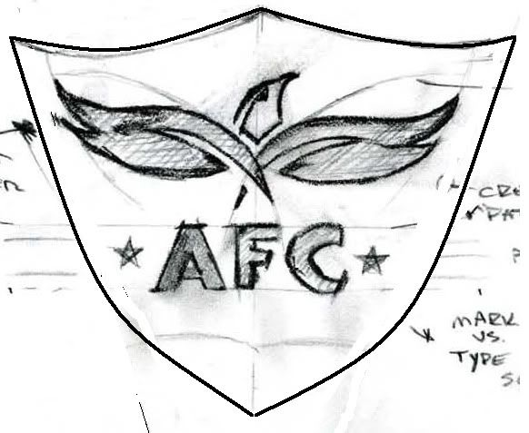
    Something in this shape would look great as a patch (but I've always been partial to the sheild shape). It's just a MS Paint of the first hand drawn logo under the picture of the flying peregrine:

    Ryan - Boise, ID
    Every normal man must be tempted at times to spit on his hands, hoist the black flag, and begin to slit throats.

  2. #37
    Join Date
    Dec 2006
    Location
    Greensboro, NC
    Posts
    10,455

    Default

    Quote Originally Posted by Hawkmom View Post
    A logo is very important and should be of a timeless design. I've always liked NAFA's logo. It is effective and tells a story. The Eagle Austringers (IEAA) logo the same. (www.austringer.org). The International Association for Falconry & the Conservation of Birds of Prey have an effective logo. It is not 'fancy' but gets the point across. www.i-a-f.org. Another is the International Hunter Safety Association (www.ihea.org) Again, it tells a story.
    I hate NAFA's logo! It smells of the uppity ups that have been in that organization for years! If you don't fly a longwing, you aren't a falconer! So tired of hearing crap like that and it is an embarrassment that a national organization promotes that attitude with its logo. Just my little humble opinion.

    And you all can remove my post above where I mutilated the logo, I was just poking fun at the new logo, didn't mean to start off a war on words. Damn, one can't even have a little fun anymore. I will slide back off into the woods to watch my coops nest and patiently wait for the eggs to hatch!
    Last edited by FredFogg; 05-12-2009 at 07:01 PM.
    Fred
    "Adopt the pace of nature: her secret is patience." ~Ralph Waldo Emerson

  3. #38
    Join Date
    Oct 2007
    Location
    Kansas
    Posts
    3,870

    Default

    Growing up in the 70's, I used to listen to Poco, a great little country rock band. They had an album out called Legend, with an album cover that I've always liked. Here is a picture of the album cover.

    I always thought some type of falconry logo in this style of artwork would be nice.

    I'm not a big fan of the new AFC logo, but if it has to do, it will do. Don't know if I'd buy and wear a baseball cap or shirt with the logo on it though. I've got a ton of hats. I have my favorites.


    Dan McCarron
    John 3: 16

  4. #39
    Join Date
    Jan 2009
    Location
    Payson, AZ
    Posts
    700

    Default

    well I would tell ya what I thought but for some reason I cant see it
    Jason Pollack, Custom Gunsmith
    http://www.pcwguns.com/

  5. #40
    Join Date
    Apr 2009
    Location
    Texas
    Posts
    178

    Default

    well it's simple and a little catchy I think with the words under it, it gives it's point. It could be more detailed, but for a small logo on a car or badge it's fine, any more complex and it will be too jumbled and would be hard to print in small sizes.

    I guess that means i like it. I like the shirt too. and the jacket. And a hat would be cool.
    Cody Birdwell

  6. #41
    Join Date
    Jul 2008
    Location
    Georgia
    Posts
    1,505

    Default

    The logo should have been red white and blue............
    the consequence of conscience, is that you'll be left somewhere......... swinging in the air.

Thread Information

Users Browsing this Thread

There are currently 1 users browsing this thread. (0 members and 1 guests)

Posting Permissions

  • You may not post new threads
  • You may not post replies
  • You may not post attachments
  • You may not edit your posts
  •